Hello,
I hope you enjoy reading through my blog and find it all easy to use and look through. I found it very enjoyable and very challenging working through this course and hope that the effort I put in during the year is worth it when you are reading through it.
Thanks,
Josh Clarke
Friday 30 March 2012
Evaluation Question 7


Since the start I have also developed my level of skills with more technical features. One example of this is the filter gallery that I used for some of my pictures. This allowed me to add effects to some of my pictures to help make them look and feel like the genre of music I have decided to make this magazine for. I believe the best example of this is the picture on my double page spread. The look of the picture now suits the genre a little bit more and the effect mixes in pictures taken of casual and smart bands such as Elbow with the unusual take on photography of MUSE. The filter gallery also allowed me to experiment with the variety of effects and the intensity of them. It may have took time but I believe all my pictures now fit the genre of music I went for which I very well helped and put across by the filter that I used on the less alternative rock looking shots.
Another tool that I am yet to mention the use of in any evaluation is the hue and saturation bar. Although when I used this I used it very gently and made very small adjustments, these small changes are vital to make a perfect and sellable magazine that could compete against the current genre competitors. The tool allowed me to just adjust the colour, lightness or darkness of my images. This can be used to make settings and artists seem darker or rockier to a lighter and more fun and pop related picture. However when I used it for my pictures I just made a small adjustment to the brightness of the pictures either way to just enhance the effects I had already applied in the filter gallery. This overall helped put then artist’s mood and music across in one picture. This would then encourage fans of my genre to purchase the magazine.

My skills have also improved with a camera. When looking at preliminary work all the pictures are relatively similar in angle and length and I also didn’t really take any thought with the background of the image either and how that would make the picture look. Therefore as you can see I ended up cutting out all of my images which also didn’t go very well at that stage with my poor cutting skill and also showed very little variation which made the magazine look boring and dull as well as unprofessional. Therefore I did a lot of practice shots before decided on my final shots for my magazine. These took into account what my artists were going to wear a bit more so they themselves fit the genre. They also took into account their pose and body language a lot more. A good example of this is the first feature shot on my contents page. The pose up against the tree shows a laid back and free look which represents one side of the spectrum of music available in this genre. The setting for these pictures has also been very well thought through. The brick work and worn out look of it has been used in pictures of real artists of this genre before, the most noticeable being Elbow, who are always photographed with a rather worn out background to show their gritty and down to earth image. However with the genre there is another side of the spectrum that I also covered with the use of the tree and field shot I took, making this magazine suitable to alternative rock fans that enjoy both sides of the spectrum.

Thursday 29 March 2012
Evaluation Question 6

Through the process of creating this magazine I have learnt a lot of new skills when using technology when in comparison with my preliminary and even my draft magazine and many of these are focused around Photoshop.
Since my preliminary I have learnt a lot more about layering my pieces and how much of a difference one small change in layering can make a big difference. An example of this is my logo from my draft in contrast to my final design logo. The splat effect that I used to show the creative side of the genre got moved from in front of the text to behind it on my final design. I just experimented with this because my feedback told me that the logo seemed a bit too extreme in front of the text. Therefore I changed the layering and the effect now looks a little more subtle and I believe fits the genre of music more now.
A big tool that I learnt about and really enjoyed using during this task would be the filter gallery when trying to manipulate my images before putting them on my magazine. My draft showed a lot of very bland and boring pictures which wouldn’t interest the reader and then stop them from buying it. Therefore I started using the filter gallery for my final design. This was a lot of fun as it allowed me to quickly experiment with a lot of varied yet good quality pre-set effects. Some of these would never suit my genre or a music magazine however with enough experimenting I found the perfect set of effects that I could use and that would suit my magazine well.
I also used custom brushes on my final piece of coursework while they also appeared on my draft work. However my draft work took some criticism for how I used them. Therefore I experimented again and chose a better looking brush that gave a better effect. I used the same custom brush on my title for both my draft and my final design while the smoke effect brush I used during my final piece did change to a more subtle one for a more professional looking and more believable look for my magazine. I started using these to give my magazine a fresh and unique effect which would catch the eye of the reader quickly and hopefully draw them in to my magazine.
Another technique I used was blurring tools. I only used these on my final design and that was because my draft design was a poor looking magazine mainly because of the poor cutting out of my pictures. A good way to use the blur tool is to make the pictures look more rounded and make them look as if they fit in the magazine and are not just layered on top. Again, this tool really helped me create a good quality and attractive magazine with a huge improvement in contrast with my draft design.
However I also learnt one or two skills on other technology while designing my magazine. These overall made a huge difference to my final magazine making it look a lot more professional and believable that it could be a real magazine.
I learnt a lot about photos and how important a good quality camera is. My draft pictures were taken by using my phone which has a five mega pixel camera with a single LED flash. The pictures seemed clear on the phone and when previewed but then when it came to resizing the picture quality dropped massively and left my magazine looking very unprofessional. I therefore then switched to a Sony Xperia Arc S with 8.1 megapixel camera and a single LED flash. These pictures were instantly a huge improvement when they were put into Photoshop. They were better for resizing and gave a better effect when they were manipulated in the filter gallery. This made my magazine look more professional and made a lot more attractive piece. This taught me the lesson that the use of a great quality camera will really help improve the overall look of the magazine.
This project also taught me that there are a huge amount of tips and advice on how to improve your photo shop skills or how to get a very well looking piece scattered on the internet. I used the internet for tips on many things. One example would the tips I searched for online about how to make it easier to cut out images. My draft magazine shows very clearly that my cutting out skill was not exactly brilliant. However with the aid of some tips online I improved and managed to create some good looking images on my final magazine. A second example would be how to use the filter gallery and how to get a good effect on some of my pictures. My draft magazine also showed a very limited skill level when adding effects to my magazine. The internet and the tips I found online helped me find some good effects which I did use on a couple of my pictures, including the double page spread picture which has taken a drastic change since the draft design.
Evaluation Question 5
I apologize if this is at all too fast for anyone trying to read the annotations!
Evaluation Question 4

My magazine has a very specific target audience of the student years and a mainly male majority of readership. I came to this decision after my analysis section showed me that similar magazines that would be competing for the same market have the same sort of male dominated readership. I checked three separate magazines and their media packs to see what my rough target audience should be. Q, NME and Kerrang! All showed me that my target audience should be from around the age of 16 to about 24. All of these magazines also have a male majority of readership which bought me to the conclusion that the genre itself has more male fans than female, this meant that if my magazine was going to attract the most readers in a large market I had to try and appeal to student males, the target market for this genre and all competing magazines.
I have tried to appeal to my target market in the choices I’ve made on the appearance of my magazine, the language used in my articles and the bands featured on the contents page. As I wanted to appeal to a more male audience I tried to include a large majority of male artists on my contents page, this was fairly easy as the genre itself is mainly full of male artists and bands such as Coldplay, Elbow and the Killers. This meant that I was appealing to the male majority of potential readers, which was a good start.
Also, I tried to use very informal and engaging language in my article and on my contents page. I did this because the use of informal language would appeal to a younger audience, as required if I’m going to appeal to my target market. Also, after my research I found that the current magazines out there are read by so many people because they are full of interviews that allow the reader to know more about their favourite bands and new and up and coming bands. Therefore I felt that I had to do an interview style article for my double page spread. I also felt like I had to use an up and coming band for my article, my research told me that many people in my target audience read the currently available magazines to keep up with the latest new bands and trends. Therefore I felt that an interview with a new band would be a very good idea. My colour scheme also took into consideration what the current market used. My research told me that the current magazines for this genre used a base colour of black and white and then used a brighter colour to engage the reader, this colour was usually red. However I wanted to use a different colour to really stand out on a magazine shelf and bring readers in from the very start. Therefore I chose to use green; this is a very youthful colour which connotes happiness and also neutrality which could represent the huge variety of music available in this genre. Plus it is a much underused colour in music magazines, which means it would easily be seen and previous readers of my magazine would make a direct link to the colour green and my magazine making it easily remember able.
However, after getting feedback on my draft magazine I decided that green wasn’t the best colour because my peers and teacher believed that this bright and fresh colour was too far away from the genre to ever be recognised as alternative rock by new readers. Therefore I spent a couple of lessons experimenting which colour I could use. I had to ensure I didn’t use red, because this is the usual colour for this genre of music which can be seen on NME and Q. I didn’t want to use red because I wanted my magazine to seem fresh and different while also bringing a familiar feel to the magazine that would be automatically remembered by previous readers of my magazine. I then ended up choosing blue, this is a fresh colour when looking at the magazine rivals I may face and it would also be very different to see on a magazine shelf and would instantly draws a potential buyer’s attention in. This may give me an edge against the already popular alternative rock magazines.
I believe that it is very important to be selective when choosing a target audience for many reasons. Firstly, by choosing a specific age range and gender, it is easier for the magazine writers to write for a specific audience. For example, if you weren’t specific with who your target audience was, your writers would have a very difficult task writing an article that would appeal to someone of the age of 8 and 80. The use of simple words that younger kids would know is not the makings of an engaging article for the older generations; therefore I believe it is very important to be specific with who your market consists of.
Secondly, the market must be specific because you have to decide what artists to feature inside your magazine. If your market is both male and female of equal proportions then you would have to feature the same amount of male and female artists. That in this genre of music would be very difficult because this genre of music seems to be very male dominant with the biggest female band probably being Paramore, who’s only female is the singer. Therefore I believe it is very important that when designing a magazine the person takes into account an age range they wish to appeal for and which gender they think would be more interested in that genre of music.
However by being selective you do exclude certain audiences from being interested in your magazine. This is by using such formal language, it then therefore doesn’t appeal to an older generation as much as my current target audience. But saying that, my genre of music doesn’t appeal to the older generations on a large scale anyway. The only real market I may miss out on by making my target audience so specific is the female population of the same age. My research told me that all magazines suited to this genre of music all appealed to men more than women. Therefore I did some research one the genre itself and Alternative rock is known to have a more male audience than female. This however doesn’t mean any women like the genre. I believe the only real way my magazine does exclude them is with the choices of bands found on my contents page. On the other hand there was no real way around this as the genre of music is dominated by male artists and female artists are very rare indeed in this genre.
Tuesday 27 March 2012
Evaluation Question 2

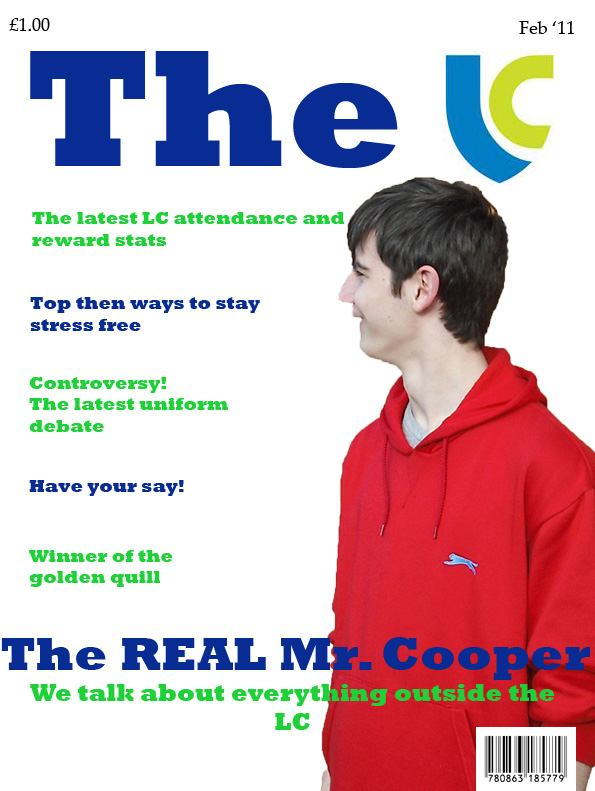
My main artist who is featured on my cover and in my double page spread is Rhys Jenkins, he is 18 and I believe his general appearance already suits the genre of music when in comparison with bands such as Elbow and R.E.M. His clothing in the shots I took is very neat yet has a casual look to it. By choosing the alternative rock genre I give myself a wide spectrum of choices of expression, location and appearance that I can choose from but I believe the most effective shots were to be of a smarter and more old fashioned side of the genre like the bands previously named.
In the pictures you can see he is wearing a smart pair of jeans, these give off a casual yet smart look to the artist which is used by some by some bands in the genre. On the cover page you can see he’s wearing a slightly more casual and almost indie style jacket but it still gives off a neat and formal feel at the same time as looking fashionable and suiting the genre of music. By making the shot a long shot it also allows the reader to see the footwear of the artist, in this picture he is wearing a fairly plain pair of Vans, this is a popular brand, especially in this genre of music.
The clothing slightly changes on the double page spread with the addition of a thick long fleece coat. This looks very smart in the pictures and the dark colour adds to the formal look of the artist and makes the greyscale effect work even well on the spread. I decided to use this effect on the double page spread as I thought it gave off the old fashioned and formal feel to the picture while it also resembled pictures taken off similar artists such as Elbow, as seen on my blog wallpaper.
I used a blank background for the shots for one main reason. I didn’t want any props or background interference to take away the reader’s attention from the artist himself. I wanted to do this because as my artist profile says, the artist is part of a rising band which therefore might not be known by the majority of readers yet. Therefore I wanted to completely focus on the artist and I felt a blank canvas background would focus the reader in specifically on the artist.
My artist profile for my feature article is shown on my cover, my contents page and then is the feature article on my double page spread. When writing my artist profile I wanted to ensure the bands background was involved and that the feeling that they were an up and coming band was felt so I could then put this across in my article. I then had to decide what I wanted their background to be, I wanted it to seem believable and resemble what the background to other more well-known bands are that resemble the type of music that my band produce. Therefore I did some research into the bands that may resemble this one, such as Elbow, R.E.M and The kings of Leon and made a past for my band by mixing a few of them together. I did this because I really wanted my profile and then my article to seem as if the band had fought for this from the very bottom and was finally getting the attention they deserve, making a real eye catching and gripping article for readers who want to learn more about a less known by rising in popularity band.
I believe my contents page attracts the whole spectrum of alternative rock fans. The massive attraction for many fans of this genre is the huge variety of music that this genre can open them up to. Therefore when choosing the artists and articles I would feature in my magazine I had to ensure that this feeling of variety was put across. I believe that I got this across by purely putting music articles in my magazine. After audience analysis I noticed that this genre of music and its fans were obsessed by music and were always listening to the radio or reading magazines to find the latest hits or new bands. Therefore I needed to completely focus my contents page on the variety of music available in this genre. I believe I have achieved this by covering both ends of the genre spectrum with bands such as MUSE, Snow patrol, Maroon 5, Coldplay and Noel Gallagher and the high flying birds.
Subscribe to:
Posts (Atom)